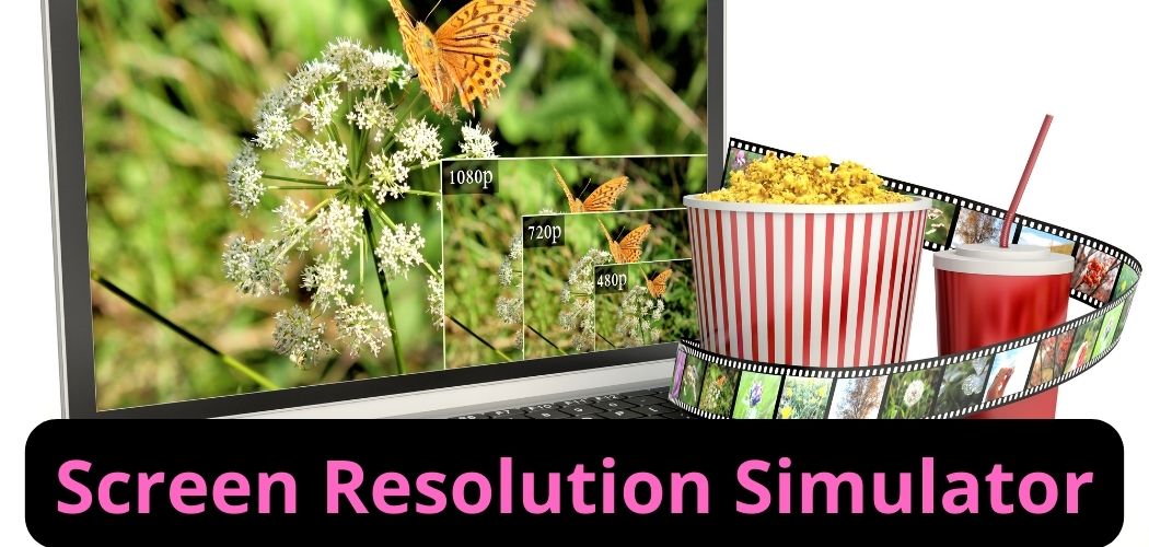
Screen Resolution Simulator
Ensure your website looks stunning on every screen size. Our Screen Resolution Simulator empowers you to preview your site's display across a range of resolutions, ensuring a flawless user experience. Try it now and perfect your site's visual appeal!
Share on Social Media:
Screen Resolution Simulator Tool
Screen resolution is a crucial factor in overall appearance and display quality of a website; ensuring your website displays well on various devices is essential for maintaining a good visitor experience.
The Screen Resolution Simulation tool allows you to validate your web pages' screen resolution across different resolutions. While developing your web application, knowing exactly how your web pages will appear and modifying them when necessary ensures the correct resolution is set.
What is the Screen Resolution Simulator?
The SocialPhy Screen Resolution Simulator is a tool that simulates different screen resolutions on a web page to check how your website will look on various resolutions and devices. Devices have different resolutions based on different manufacturing factors. Here are examples of common screen resolutions:
- 1280 x 720: Resolution of some laptops.
- 540 x 960: Resolution of some smartphones.
- 768 x 1024: Resolution of some tablets.
Using the screen resolution simulation tool allows you to test your website's appearance on different devices and ensure it displays well on various resolutions.
How to Use the SocialPhy Screen Resolution Simulator?
Using the SocialPhy Screen Resolution Simulator is straightforward. Simply copy the URL of the webpage you want to simulate and paste it into the toolbox. Then choose the resolution from the available list or use custom resolution to set your desired resolution manually. Here's how to use our screen resolution simulator in simple steps:
- Go to the webpage you want to simulate resolution for and copy its URL.
- Paste your website's URL inside the toolbox.
- Select the resolution you want to simulate from the menu, or customize the resolution manually by selecting the custom resolution option.
- Click the simulate button, and a new window will open simulating the webpage of the URL you entered with the selected resolution.
Why Should You Use Our Screen Resolution Simulator Tool?
There are several reasons why you should use the SocialPhy Screen Resolution Simulator, including:
- Validating your web pages' appearance on different devices.
- The SocialPhy Screen Resolution Simulator can simulate any screen resolution, even if it's not available in the menu. You can select the custom option and enter the desired resolution.
- You can simulate your webpage's screen resolution in a very short time. Our tool is fast and shows results instantly.
- The tool is designed to work efficiently and look beautiful.
- Our tool is free, and you can use it for an unlimited time.
What is Screen Resolution?
The image on any screen is formed by several units arranged vertically and horizontally called pixels, and the number of these pixels forms what is called screen resolution. Screen resolution is the number of pixels in a row and in a column that make up an image on a screen. The higher the number, the more detailed or sharp your images will be. Common screen resolutions include 1024 x 768, 1280 x 800, and 1440 x 900.
How Does Our Screen Resolution Simulator Work?
Our screen simulation tool works by opening a new page and resealing the web page's resolution to match the chosen resolution so you can see how your web page looks at a different resolution. You can simulate any screen resolution with the desired size, device pixel ratio, and orientation.
What is the Benefit of the Screen Resolution Simulation Tool?
Because the users of your website will use different types of devices to visit your website, and you must ensure your website displays correctly. The screen resolution simulation tool allows you to check your website's performance on different screen resolutions and browsers.
This tool can be used for various purposes, such as checking if a website will work for a specific device or browser, or testing a website's design before it goes live. The simulator can also be used to examine how a site's design changes as the width of your browser window changes.
How to Check Your Website's Screen Resolution?
To check your website's resolution online and for free, copy the URL of the webpage you want to check its resolution, then use a screen resolution simulator like the SocialPhy tool and paste the URL of the webpage into the toolbox, select the resolution of your choice, and click the simulate button. The tool will then open a webpage in a new window with the resolution you selected.
Is Screen Resolution Important?
Screen resolution is crucial; it defines the quality, clarity, and sharpness of the image and video and will affect your website's appearance and user experience. The higher the screen resolution, the better the image will be displayed with good quality and details.
Screen resolution not only affects images on the webpage but also affects the text displayed, so you must ensure your website appears in good quality for visitors so you can attract them to interact with the content.
What is the Difference Between Screen Resolutions and Screen Size?
Screen Resolution is the number of pixels arranged in a horizontal and vertical pattern to form the image on your screen, while Screen Size is the physical dimensions of your device's screen and is measured in inches, but screen size also affects the image quality displayed. A smaller screen with a specific resolution will provide a better quality image than a larger screen with the same resolution because the higher the PPI (Pixels per inch), the better the image quality.
Is 1920x1080 Screen Resolution Good?
1920 x 1080 is the FHD (Full High Definition) resolution; it is the standard screen resolution because it provides good image quality and is suitable for laptop screens.
What is the Best Screen Resolution?
The best screen resolution depends on different factors, such as the type of device you are using and the purpose of using it. But generally, the most commonly used screen resolution is 1920 x 1080.
Other very useful tools for SEO:
- Website Screenshot Generator
- Online HTML Viewer
- WordPress Theme Detector
- Get HTTP Header
- Htaccess Redirect
- Mobile Friendly Test
- Adsense Calculator
- Twitter Card Generator
- Open Graph Generator
- Xml Formatter
- HTML Minifier
- Javascript Minifier
- CSS Minifier
- Online Ping Website Tool
- URL Opener
- URL Encoder Decoder
- Base64 Encode Decode
- QR Code Generator
- XML Sitemap Generator
- HTML Editor
- Bulk Email Validator